Enhancing Clarity with Animated Network Diagrams for Engineers and Architects
In the fast-paced world of engineering and architecture, clear communication is paramount. Animated network diagrams provide a dynamic way to visualize complex systems, making it easier for teams to convey ideas and facilitate discussions with stakeholders. In this article, we explore the benefits of animated diagrams, focusing on clear layers, motion for packet flow, and effective handoff to stakeholders.
The Importance of Animated Diagrams
Animated diagrams serve as powerful tools for engineers and architects. They transform static representations into engaging visuals that illustrate how components interact over time. This adds depth to presentations, allowing stakeholders to grasp intricate details without needing extensive technical knowledge.
Benefits of Animated Network Diagrams
- Enhanced Understanding: Dynamic visuals make it easier to comprehend complex network architectures.
- Improved Communication: Facilitates discussions between technical teams and non-technical stakeholders.
- Real-time Feedback: Enables immediate visualization of changes or suggestions during meetings.
- Increased Engagement: Captures the attention of the audience, making presentations more impactful.
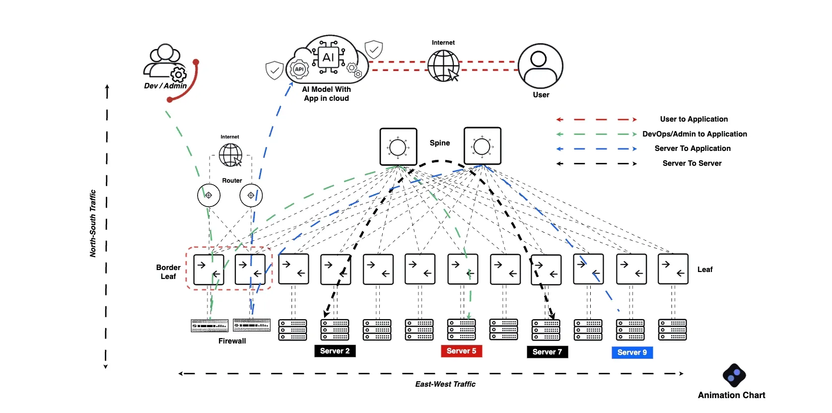
Clear Layers for Effective Visualization
When creating animated network diagrams, clear layering is essential. Layers should represent different aspects of the network, such as:
- Infrastructure: Physical and virtual devices, including servers and routers.
- Data Flow: Paths that data packets take through the network.
- Security: Layers that indicate security protocols and measures.
Tips for Layering
- Use distinct colors for each layer to avoid confusion.
- Keep the number of layers manageable to maintain clarity.
- Use labels and legends to provide context for each layer.
Motion for Packet Flow
Incorporating motion into animated diagrams can significantly enhance the understanding of packet flow. Visualizing how data travels through the network allows teams to identify potential bottlenecks and optimize performance. Here are some effective strategies:
- Animated Arrows: Use arrows to indicate the direction of data flow.
- Speed Variation: Adjust the speed of animations to highlight critical paths.
- Color Changes: Utilize color shifts to represent different states of packet flow (e.g., processing, waiting).
Handoff to Stakeholders
Once the animated network diagram is complete, effectively handing it off to stakeholders is crucial. This phase ensures everyone is on the same page and can provide valuable feedback. Consider these steps:
- Provide Context: Accompany the diagram with a brief overview of its purpose and key components.
- Encourage Questions: Foster an open environment for stakeholders to ask questions.
- Follow-Up: Schedule a follow-up meeting to discuss feedback and any necessary adjustments.
Checklist for Handoff
- Contextual overview provided.
- Key components explained.
- Questions encouraged.
- Follow-up meeting scheduled.
In conclusion, animated network diagrams are invaluable for engineers and architects, improving clarity and communication. By focusing on clear layers, motion for packet flow, and effective handoff to stakeholders, teams can enhance their presentations and foster better collaboration.